hundertwasser/Klimt project
evaluate
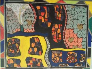
This painting was very difficult. it was super fun but it was hard to make the different patterns stand out. Making different colors and able to run a tad bit free on it. This is not a style that I have really ever done so doing a big painting based around a style I am not used to was hard. the sections in this painting were supposed to be very bright and flat so It was different but it took less time because I didn't have to really worry about value or texture. even thought this seems like a simple project it was a lot harder than it looks but over all I think that I did a good job. this project has helped me become more comfortable using other styles than my own allowing me to grow as an artist. challenges that I faced was thinking of what colors would look good because surprisingly not a lot of colors fit with Hundertwasser's style so I added a lighter blue and it stands out from the other colors. I still like the blue because it is different than the other colors and I do like how it stands out but it isn't what I had planned. I love the silver and gold that he puts into his pieces I think that was my favorite piece, just putting silver and gold over the darker colors. it defiantly made the painting look completely different after I did that.
This painting was very difficult. it was super fun but it was hard to make the different patterns stand out. Making different colors and able to run a tad bit free on it. This is not a style that I have really ever done so doing a big painting based around a style I am not used to was hard. the sections in this painting were supposed to be very bright and flat so It was different but it took less time because I didn't have to really worry about value or texture. even thought this seems like a simple project it was a lot harder than it looks but over all I think that I did a good job. this project has helped me become more comfortable using other styles than my own allowing me to grow as an artist. challenges that I faced was thinking of what colors would look good because surprisingly not a lot of colors fit with Hundertwasser's style so I added a lighter blue and it stands out from the other colors. I still like the blue because it is different than the other colors and I do like how it stands out but it isn't what I had planned. I love the silver and gold that he puts into his pieces I think that was my favorite piece, just putting silver and gold over the darker colors. it defiantly made the painting look completely different after I did that.
final artwork
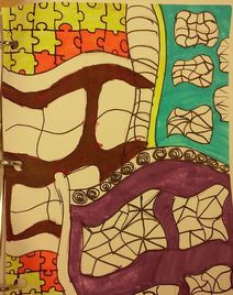
progress
|
|
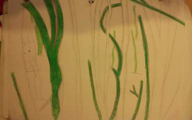
nature water color project
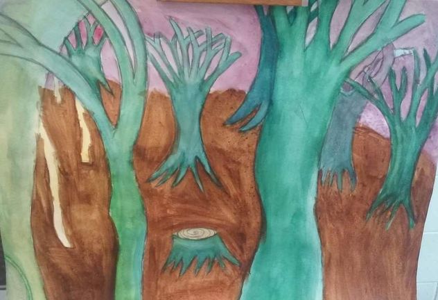
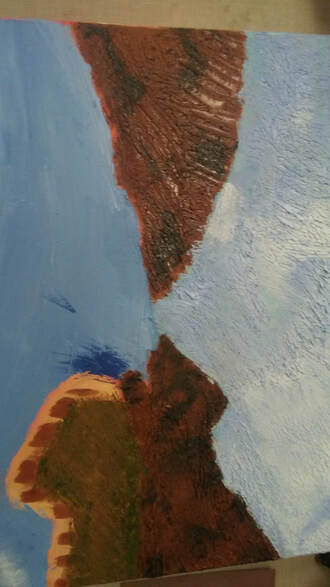
when I was thinking about what picture I wanted to do I have multiple pictures of trees that I really like and have always wanted to draw or paint so I picked a landscape with trees. I wanted to have a cool somber look to the color scheme so I used a lot of browns, blues and greens. I chose to use darker colors in the trees farther away and lighter ones to the trees in front closer to add depth to the piece. I was struggling with my ground because I could make the color that I was looking for so every time that I made a color I layered it on top of the last color making another color and I kept trying to layer it to cover it up but the color didn't change and it just kept getting darker. I also struggled with composition in my piece because I wanted to foreground to be really exaggerated and I wanted it to stand out from the background more than it turned out. Make differences in the colors was hard and I got confused because I would run out of a color and not be able to make it again making really noticeable differences in the sections I was paint. I struggled mostly with just how the painting looked in the end because it wasn't what I had imagined in my head. I did like how the colors turned out with the blues and the greens on the trees I thought that made the piece pop more. this piece I think helped me even though I struggled it taught me that I can plan more on my future pieces and make sure that I have enough paint, can mix colors better, and I can learn how to add more composition. something that I learned doing this project is that you really need to think about the layers that you're putting down on the paper because it is hard to cover up mistakes with water color but I also learned that it is so much easier to create softer colors just by adding water.
final artwork
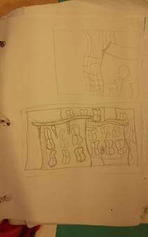
nature water color progress photos
|
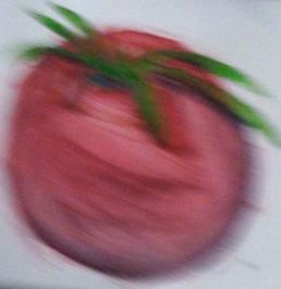
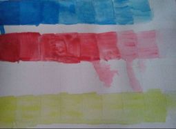
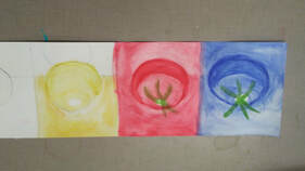
water color fruit practice
During this practice we worked on value, making colors, and texture. I chose to use a tomato as my reference and I had to make it look smooth. we layered different colors to build up to our final piece. we were aloud to use some of the techniques that we learned in the lessons we did before.
|
|
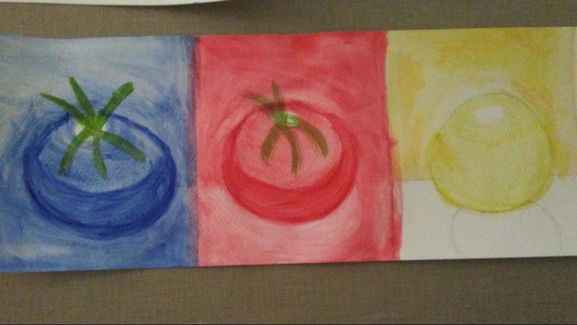
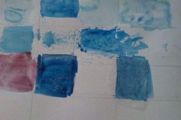
water color practice
describe what we did during this practice
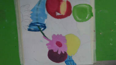
we learned to use the water color to our advantage using the whites and lighter layers of the paints, the water also helped make things softer and more adaptable. we had to mix paint to get different values. this practice was teaching us how to mix colors to get the look we want in a color. this was also another practice where she wanted us to give texture and depth to shapes on paper.
we learned to use the water color to our advantage using the whites and lighter layers of the paints, the water also helped make things softer and more adaptable. we had to mix paint to get different values. this practice was teaching us how to mix colors to get the look we want in a color. this was also another practice where she wanted us to give texture and depth to shapes on paper.
|
|
|
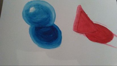
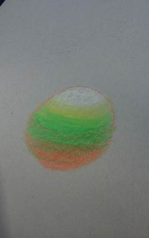
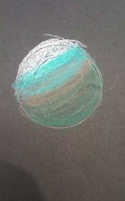
color blending practice
describe what we did during this practice
this was a practice to help mix my colors. learn which colors work better together and make things like less streaky and more of a mixed neat and well thought out mix of colors. we had to take three colors and blend them to create smooth texture and value to make a 2-D picture look 3-D I chose cooler colors on mine, green and blue.
this was a practice to help mix my colors. learn which colors work better together and make things like less streaky and more of a mixed neat and well thought out mix of colors. we had to take three colors and blend them to create smooth texture and value to make a 2-D picture look 3-D I chose cooler colors on mine, green and blue.
|
|
|
|
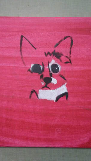
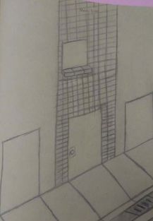
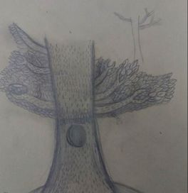
Assessment pictures
describe what we did during this practice
I was practicing how to sketch and draw. this was to show our abilities and what we are able to do before the class. I did a lot of sketching and smogging to make darker and lighter spots in the drawing. with the perspective drawing I used straight likes to make it look more neat. on the tree drawing I wanted to add designs to add value almost like a pen and ink piece just with a pencil instead. on all of the drawings I did I added a lot of shading and tried to use different techniques to get the look I wanted.
I was practicing how to sketch and draw. this was to show our abilities and what we are able to do before the class. I did a lot of sketching and smogging to make darker and lighter spots in the drawing. with the perspective drawing I used straight likes to make it look more neat. on the tree drawing I wanted to add designs to add value almost like a pen and ink piece just with a pencil instead. on all of the drawings I did I added a lot of shading and tried to use different techniques to get the look I wanted.
|
|
